
A great client portal makes the next step obvious the second someone logs in, whether that's paying an invoice or approving a proof. Start by picking the single job your portal must solve, then build the dashboard around that action first. RealClients processed over $48 million invoiced through portals last year by following exactly that rule. Choose your primary job before you touch a single layout decision.
TL;DR:
- Design the portal around one primary client task, such as paying an invoice or approving a file, before customizing layout features.
- Use role-based views and shallow navigation with clear labels to minimize clutter and improve usability for different client roles.
- Prioritize a simple, action-focused dashboard with one prominent call to action and supporting widgets to prevent data overload.
- Implement a branding strategy with custom domains, role-specific personalization, and default security features like two-factor authentication.
- Focus on core features—file sharing, messaging, invoicing, and approval flows—before adding secondary functions, and track engagement metrics to ensure adoption.
Table of Contents
- Client Portal Design Examples Worth Copying
- What Makes Client Portal UI Design Actually Work
- What Belongs on the Dashboard (and What Doesn't)
- Structuring Navigation So Clients Never Get Lost
- Designing for Phones Without Losing Function
- Making the Portal Look Like Yours, Not a Vendor's
- Security Features Clients Expect by Default
- The MVP Feature List That Actually Matters
- Three Ways to Actually Build the Thing
- Starter Layouts You Can Deploy This Week
- Real Numbers Behind Real Portal Design
- Getting Clients to Actually Log In
- Keeping the Portal Fast as Client Lists Grow
- Building a Portal That Works for Every Client
- Connecting the Portal to Your Other Tools
- What Analytics Inside the Portal Actually Tell You
- Making the Portal Feel Built for Each Client
- Where Client Portal Projects Usually Go Wrong
- Publisher Perspective: Prioritized Advice for Small Teams
- RealClients: A Ready Portal Without the Build
- Sources
Client Portal Design Examples Worth Copying
You don't need to invent a layout from scratch. Four service categories cover most of what freelancers and agencies actually need, and each one has a signature pattern worth stealing.
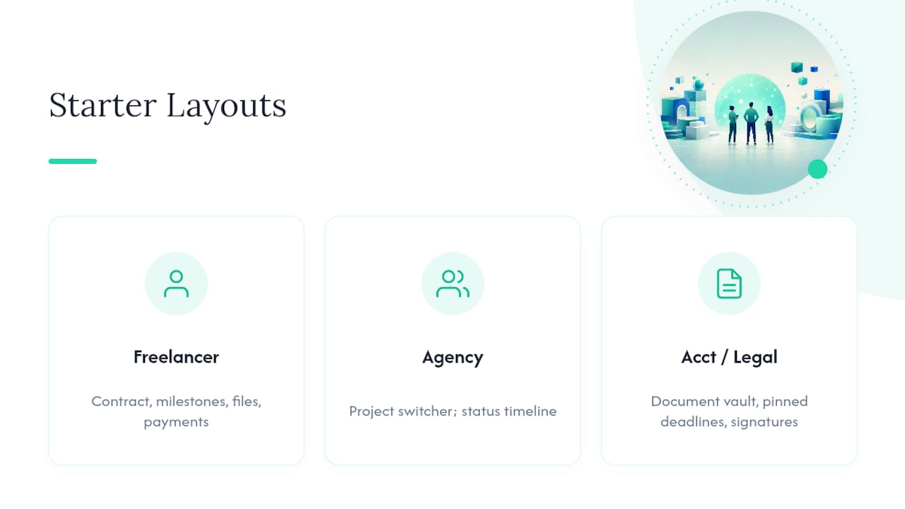
Agency portal. Agencies juggle multiple projects per client, so the strongest layouts lead with a project switcher at the top and a status timeline underneath. The UX win here is visual progress tracking: clients see exactly where their project stands without emailing to ask. The warning is scope creep in the interface itself. Agencies love adding tabs for every deliverable type until the navigation resembles a file cabinet nobody wants to open.
Freelancer portal. Solo operators need something leaner: one client, one project, one thread. The best freelancer layouts collapse everything into a single scrollable view, contract, milestones, files, and payment in that order. The UX win is reduced clicking; the whole relationship lives on one page. The risk is cramming too much into that single view and losing the visual hierarchy that made it clean in the first place.
Accounting portal. Financial clients want reassurance more than novelty. The pattern that works is a document vault front and center, with tax deadlines pinned above it like a calendar reminder. The UX win is trust through transparency, showing exactly what's been received and what's outstanding. The warning: don't bury the "sign here" action under a wall of downloadable PDFs. Signature requests need their own visual weight.
Law and consulting portals. These lean formal by necessity, e-signature workflows, retainer balances, and secure messaging dominate the layout. The UX win is compliance made visible: clients can see engagement letters and signed documents in one place instead of digging through email chains. The warning is over-formality. A portal that looks like a legal filing system feels cold, and cold portals get logged into less.
Real examples across these industries share seven recurring patterns: clean layouts, self-service flows front and center, a branded look rather than a generic template feel, mobile-friendly screens, and visible security cues. If you're deciding which layout fits your business, match the pattern to how often your client needs to act versus simply check status:
- High-frequency action (freelancers, consultants billing per milestone): single-page, action-first layout.
- Multi-project complexity (agencies, studios): project switcher plus timeline.
- Document-heavy, low-frequency (accountants, lawyers): vault-first with pinned deadlines.
- Compliance-sensitive (legal, financial advisory): formal structure with prominent security signals.
Pick the pattern that matches your client's actual behavior, not the one that looks most impressive in a screenshot.
What Makes Client Portal UI Design Actually Work
Portal design is not website design wearing a different hat. A marketing site has to win someone's attention in seconds; a portal has to serve the same returning user for weeks or months, often under stress, often on a deadline. That distinction changes almost every design decision you'll make.
-
Design around user jobs, not features. Before you sketch a single screen, list the three things a client logs in to actually do: pay an invoice, approve a file, check a deadline. Everything else is secondary. Portal UX differs from marketing UX precisely because it has to support long-term, repeat usability rather than first-time discovery.
-
Build role-based views. A project manager and a billing contact at the same client company need different dashboards. Show the project manager files and timelines; show the billing contact invoices and payment history. One-size-fits-all dashboards create clutter for everyone.
-
Keep navigation shallow. Three or four top-level items, Dashboard, Files, Messages, Billing, beat a nested menu with sub-categories. If a client has to hover over a menu to find a submenu, you've already lost momentum.
-
Use plain labels. "Invoices" beats "Financial Documents." "Messages" beats "Communication Center." Jargon might sound professional, but it slows recognition, and recognition speed is the whole point of good client dashboard design.
-
Let hierarchy point to actions, not data. Bold the "Pay Now" button. Gray out the metadata around it. Raw numbers and timestamps matter less than the one thing you want the client to click.
-
Build a design system early. Consistent buttons, spacing, and color tokens are the cheapest insurance against your portal turning messy as you add features. This is one of the most overlooked levers in client portal design; teams that skip it end up rebuilding entire screens six months later just to make new features look like they belong.
-
Bake in accessibility from day one. Sufficient color contrast, keyboard navigation, and readable font sizes aren't optional polish. They're what separates a portal that works for every client from one that quietly excludes some of them.
What Belongs on the Dashboard (and What Doesn't)
The dashboard is the first screen a client sees after logging in, and it has about three seconds to earn its keep. If the client can't tell what to do next, the design has already failed.
Put one primary action card above the fold. That's it, one card, not three competing calls to action. If a client owes a payment, "Pay $2,400 Invoice" should dominate the screen. If a proof needs sign-off, "Approve Design Files" takes that spot instead. Everything else supports that single action; nothing competes with it.
Below that card, a handful of supporting widgets round out the picture:
- A progress bar showing project completion percentage
- A recent activity feed (last file uploaded, last message sent)
- A running invoice summary with paid/unpaid status
- An unread message indicator
The mistake most teams make is showing everything at once: every file, every past invoice, every historical message thread, all crammed onto the first screen. That's data overload, and it buries the one action that matters. Dashboards with a clear primary action tend to lift daily active use by a meaningful margin over cluttered alternatives, according to UX pattern research. Use progressive disclosure instead: show a summary card, let the client click through for the full invoice history or message archive.
If you want concrete numbers to anchor a KPI card, something like "3 of 5 milestones complete," "$1,200 outstanding," or "2 files awaiting your review" gives clients an immediate sense of where things stand without forcing them to interpret a chart.
Pro Tip: Test your dashboard by covering everything except the primary action card. If a client couldn't figure out what to do next from that card alone, your hierarchy needs work.
Structuring Navigation So Clients Never Get Lost
Sidebar or top nav? The rule is simpler than most designers make it. If your portal has four or fewer sections, a top nav works fine and keeps more screen space for content. Once you cross five or six sections, especially with sub-items like "Invoices" and "Payment History" under a Billing umbrella, a sidebar handles that depth without crowding the header.
A few patterns keep navigation intuitive regardless of which structure you choose:
- Add breadcrumbs on any page more than one click deep, so clients always know how to get back.
- Put search in a fixed, visible spot rather than tucking it behind an icon; clients hunting for a specific invoice or file don't want to guess where to look.
- Offer contextual shortcuts. A message about a specific file should link directly to that file, not send the client back to a folder to search for it.
- Name menu items the way your client would say them out loud. "My Files" beats "Document Repository" every time.
Role mapping matters just as much as labeling. A billing contact should see Billing prominently in their menu; a project lead should see Files and Timeline first. If your portal supports multiple roles, build the navigation per role rather than showing every menu item to every user and hoping people ignore what doesn't apply to them.
Designing for Phones Without Losing Function
More than half of your clients will check their portal from a phone at least once, usually to glance at a deadline or approve something quickly between meetings. Bottom tab bars work better than top navigation on mobile because they sit within thumb's reach. Stack your dashboard cards vertically rather than trying to preserve a desktop grid, and make every tappable element at least 44 pixels tall so nobody mis-taps a "Decline" button meant to be "Approve."
Simplify forms aggressively on mobile. A five-field intake form that works fine on desktop becomes a frustrating scroll-and-pinch exercise on a phone screen. Break long forms into steps instead. For file downloads, make sure large PDFs or design files open in-browser or trigger a native download rather than forcing a redirect that stalls on a weak connection.
Before launch, test on an actual phone, not just a resized browser window: check that the primary action button is reachable with one thumb, that text doesn't require zooming, and that file uploads work on both WiFi and mobile data.
Making the Portal Look Like Yours, Not a Vendor's
The fastest way to undercut trust is to let your client see someone else's logo. A custom domain (portal.yourbrand.com) instead of a generic subdomain signals that this is your business, not a rented tool. Swap in your logo, your brand colors as design tokens, and remove any visible vendor branding from the login screen and footer.
Decide early whether you're branding per client or per company. Agencies with dozens of active clients usually brand once at the company level and personalize with the client's name and project details inside. Freelancers working with a handful of high-touch clients sometimes go further, custom welcome banners, a client-specific quick-task list on login. That extra mile costs little and reads as attentiveness.
Security Features Clients Expect by Default
Clients handing over signed contracts and payment details expect baseline security, whether or not they ever mention it. Skipping these features doesn't just create risk; it quietly damages trust.
- Offer single sign-on (SSO) for agency clients managing multiple team logins, and two-factor authentication (2FA) as a default for everyone else.
- Build role-based access controls so a client's junior team member sees files but not billing history.
- Keep an audit log of who viewed or downloaded what, especially for contracts and financial documents.
- Encrypt data both in transit and at rest, and give clients a clear path to export their files if they ever leave.
None of this needs to be visible to impress clients. It needs to be present so nothing goes wrong.
The MVP Feature List That Actually Matters
Ship these first: file sharing with version history, direct messaging, invoicing, and an approval flow for deliverables. That's the core loop almost every service business needs, and building it well beats building ten features poorly.
- Ship first: files, messages, invoices, approvals
- Add later: appointment scheduling, team collaboration tools, deeper analytics, CRM sync
- Track adoption with three KPIs: portal logins per client per month, daily active users among invited clients, and support ticket deflection (how many "where's my file" emails disappeared after launch)
A short onboarding checklist completed in under four minutes measurably improves activation rates, so resist the urge to pack the MVP with extras before you've proven clients will use the basics.
Three Ways to Actually Build the Thing
Pick your primary job before choosing a build path, not after. A portal meant to collect approvals needs different infrastructure than one meant to process payments, and choosing the tool first often locks you into the wrong shape.
- No-code / curated SaaS. A platform like RealClients gives you branded workspaces, e-signatures, and Stripe or PayPal payment processing without writing code. Time to launch: days, not weeks. Trade-off: less control over highly custom layouts, though most service businesses never need that level of customization anyway.
- SaaS embed. Some tools let you embed portal components into an existing site. Faster than custom code, but you're stuck with whatever the underlying tool supports, and switching later means rebuilding.
- Custom build. Full control, full responsibility. Open-source demos using Next.js, TypeScript, Tailwind, and shadcn/ui or a React frontend paired with a FastAPI backend give you a real starting point, but budget weeks, not days, and plan for ongoing maintenance. Custom portals succeed when you launch with three or four working features rather than trying to ship everything at once.
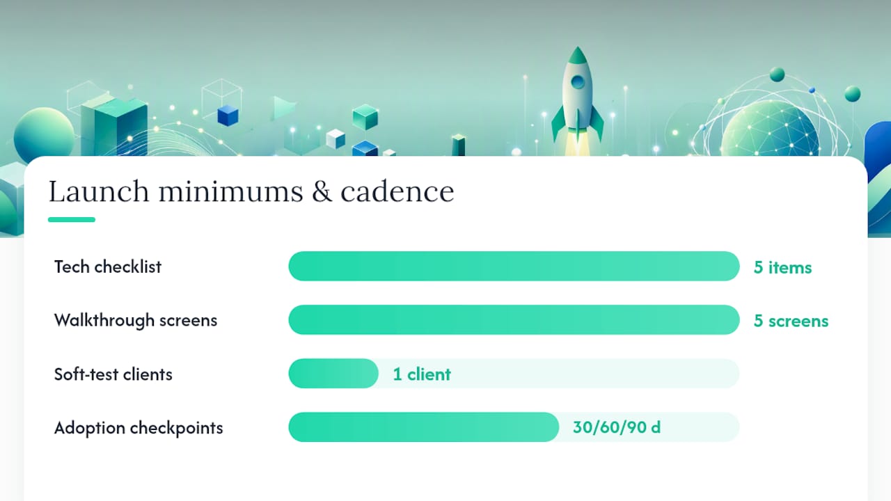
Whatever path you choose, your minimum technical checklist stays the same: authentication, a working dashboard, file storage, a billing connection, and a client invite flow. Skip any of those and the portal isn't launchable yet, no matter how polished the design looks.
For launch, build a simple walkthrough (five screens, tops), invite one live client as a soft test, and follow a 30/60/90 day adoption plan to track whether logins and engagement actually stick.
Pro Tip: If you're choosing between an embed and a custom build, read up on how scalable SaaS workflows get architected before committing. Retrofitting scalability after launch costs far more than planning for it up front.
Starter Layouts You Can Deploy This Week
Three starter templates cover most small-business needs. A freelancer template puts contract, milestones, files, and payment on one scrollable page, swap in your client's project name and milestone dates and you're live. An agency template adds a project switcher and status timeline, customize per client by duplicating the workspace and updating branding tokens. An accountant or legal template leads with a document vault and pinned deadlines, adjust the compliance language and signature fields per engagement type.
Deploy on a branded subdomain rather than embedding inside your main site; it keeps the portal feeling like a dedicated workspace. RealClients' own example gallery shows several of these layouts already built out if you want a faster starting point than sketching from scratch.
Real Numbers Behind Real Portal Design
RealClients built its platform specifically for freelancers, agencies, and small businesses that got tired of juggling five tools to manage one client relationship. The portal bundles messaging, file sharing with version history, e-signatures, invoicing, and direct Stripe and PayPal payment processing into a single branded workspace, no stitching together separate apps for contracts and payments.
That integration shows up in the numbers: freelancers and studios using RealClients portals invoiced over $48 million last year, a scale that reflects real, sustained client usage rather than a one-time setup. The design philosophy behind it stays close to the action-first dashboard principle covered earlier in this guide: surface the next step, hide the rest until it's needed.
Getting Clients to Actually Log In
A beautifully designed portal that nobody uses is worse than no portal at all, because now you're maintaining two communication channels instead of one. Adoption starts before the client ever logs in for the first time.
Send the invite with a specific reason attached: "Your contract is ready to sign" beats a generic "Here's your portal, take a look." The first login should immediately confront the client with that exact task, not a blank dashboard they have to explore. If your onboarding takes longer than a few minutes to complete, most clients will abandon it and go back to emailing you directly, undoing the entire point of the switch.
Build a short checklist into that first session: confirm contact details, review the current contract, and set a payment method. Each completed step should feel like progress, not paperwork. Once a client has completed one action inside the portal, whether that's approving a file or paying an invoice, they're far more likely to return for the next one.
After launch, don't assume silence means satisfaction. Check login frequency weekly for the first month. If a client hasn't logged in within a week of receiving an invite, a short personal nudge, not an automated reminder, usually gets better results. The goal isn't to force usage; it's to make the portal genuinely easier than the alternative, so clients choose it on their own after the first try.
Keeping the Portal Fast as Client Lists Grow
Speed problems in client portals rarely show up in testing and almost always show up after your third or fourth client comes on board with a folder full of large files. A portal that felt instant with one test account can slow to a crawl once real usage kicks in.
Lazy-load anything below the fold, file thumbnails, message history, older invoices, so the dashboard itself loads fast even as a client's data grows. Compress and resize image previews rather than serving full-resolution files inside the browser; save the original file for download only. Cache dashboard summary data instead of recalculating progress percentages and invoice totals on every page load.
Scalability is really a database and architecture question more than a visual one. As you add clients, make sure your data model separates each client's workspace cleanly so one client's large file library doesn't slow down queries for everyone else. If you're building custom, this is where architecture choices made early save you from a painful rebuild later.
Test load times on a throttled connection, not just your office WiFi. A portal that loads instantly at your desk might take eight seconds on a client's phone during a commute, and that gap is often the difference between a client who checks in weekly and one who gives up and emails you instead.
Building a Portal That Works for Every Client
Accessibility in a client portal isn't a legal checkbox exercise, it's the difference between a design that serves everyone who logs in and one that quietly locks some people out. A client with low vision, a motor impairment, or someone simply squinting at a phone screen in bright sunlight all run into the same friction points.
Contrast is the easiest win and the most commonly skipped one. Light gray text on a white background looks clean in a mockup and becomes unreadable for a meaningful share of real users. Stick to contrast ratios that meet WCAG AA standards for anything that carries information, invoice totals, deadline dates, status labels.
Every interactive element needs to work without a mouse. That means visible focus states on buttons and links, and a tab order that follows the visual layout instead of jumping around the page. Screen reader users depend on properly labeled buttons ("Approve File" rather than an unlabeled icon) to understand what an action actually does before they take it.
Font size and touch target size matter together. Text that's technically readable but paired with a tiny tap target creates the same frustration as text that's too small to read at all. Give buttons room to breathe, especially on mobile.
None of this requires a separate accessible version of your portal. Building these choices into the base design from the start costs almost nothing extra and means every client, regardless of ability or device, gets the same functional experience.
Connecting the Portal to Your Other Tools
A client portal that lives in complete isolation from your other business tools creates double data entry, and double data entry is where mistakes creep in. The most valuable integrations connect the portal to the systems you're already running your business on.
CRM integration matters most for agencies managing dozens of client relationships across sales and delivery. When a deal closes in your CRM, that client's portal workspace should spin up automatically, project details, contact info, and initial files already populated, rather than someone manually recreating that setup a second time.
Billing integration is close to a baseline expectation at this point. Connecting Stripe or PayPal directly into the portal means invoices generate, get paid, and get logged without a separate accounting step. RealClients builds this in natively rather than requiring a third-party connector, which removes a common point of failure where payment status and portal status quietly drift out of sync.
Support tool integration helps smaller teams especially. If a client's message inside the portal can trigger a ticket in your existing support system, or vice versa, nobody has to check two inboxes to know what's outstanding. The overall principle: every integration should reduce a manual step, not add a new dashboard for you to monitor. If a connection doesn't remove work, it's probably not worth the setup time.
What Analytics Inside the Portal Actually Tell You
Most teams that build a client portal never look at usage data again once it's live, and that's a missed opportunity. The behavior inside your portal tells you exactly where clients get stuck, long before they email you frustrated about it.
Track login frequency per client first. A client who logged in once at setup and never again is a warning sign worth a personal check-in, not an automated nudge. Track which dashboard widgets actually get clicked versus ignored; if nobody's opening the "recent activity" feed, that screen real estate could serve the primary action better.
Time-to-complete matters more than raw click counts. If approving a file takes clients an average of six minutes when it should take thirty seconds, something in that flow is broken, extra steps, unclear labels, a confusing button. Support ticket volume tied to specific portal pages is another useful signal: a spike in "how do I download this file" messages usually points to a UI problem, not a client problem.
You don't need enterprise-grade analytics tooling to get this. Basic event tracking on key actions (login, file download, invoice paid, message sent) gives you enough signal to spot friction points within the first month of real usage.
Making the Portal Feel Built for Each Client
Generic portals feel like software. Personalized ones feel like a service. The gap between those two experiences is smaller to close than most teams assume, and it rarely requires custom development for each client.
Start with the welcome message. A dashboard that greets "Sarah" by name with a note referencing her specific project reads entirely differently than a generic "Welcome to Your Portal" banner. Surface each client's next action based on where their project actually stands, a client mid-contract sees "Review Your Agreement," while one near project completion sees "Approve Final Files," rather than showing every client the same static homepage.
Let returning behavior shape what's visible. A client who checks invoices weekly benefits from that widget staying prominent; one who never opens the message thread might not need it taking up top-of-page space. This is where role-based views from earlier in this guide extend into something more granular: personalization by behavior, not just by job title.
Small touches add up. A quick-task list specific to that client's current milestone, a progress bar showing their actual completion percentage rather than a generic template, these details cost little to build but signal that the client's specific situation matters, not just their subscription tier.
Where Client Portal Projects Usually Go Wrong
Most portal failures trace back to a handful of repeatable mistakes, and recognizing them early saves you from rebuilding later.
Feature overload before adoption. Teams build messaging, invoicing, scheduling, analytics, and a client-facing knowledge base before a single client has logged in twice. Ship the core loop, files, messages, invoices, approvals, and prove clients will use it before adding anything else.
Confusing navigation labels. "Deliverables" instead of "Files." "Correspondence" instead of "Messages." Internal team jargon leaking into client-facing labels is one of the most common and easiest fixes available.
Ignoring the first-login experience. A client's first fifteen seconds inside the portal set the tone for whether they'll return. A blank dashboard with no clear task kills momentum instantly.
Treating security as an afterthought. Bolting on 2FA or access controls after a client asks about it, rather than building them in from the start, creates both a trust problem and a scramble to retrofit.
No adoption tracking. Teams launch and never check whether clients are actually logging in. If you're not tracking login frequency and support ticket volume, you won't know a portal is failing until a client tells you directly, usually by going back to email.
Publisher Perspective: Prioritized Advice for Small Teams
Curated platforms beat custom builds for almost every small team, unless you have a genuinely unusual workflow that off-the-shelf tools can't fit. Three rules keep you out of trouble: ship one job well before adding a second, never skip the first-login test, and track logins from day one, not month three. If you're short on time, start narrow: pick billing or approvals, launch it in a week, and expand only once clients are actually using it.
— Real
RealClients: A Ready Portal Without the Build
Skip the months of custom development and get a branded, integrated portal live in days instead of weeks. RealClients bundles messaging, file sharing with version history, e-signatures, invoicing, and Stripe or PayPal payment processing into one workspace, so freelancers, agencies, and small businesses stop juggling five disconnected tools to manage a single client relationship.
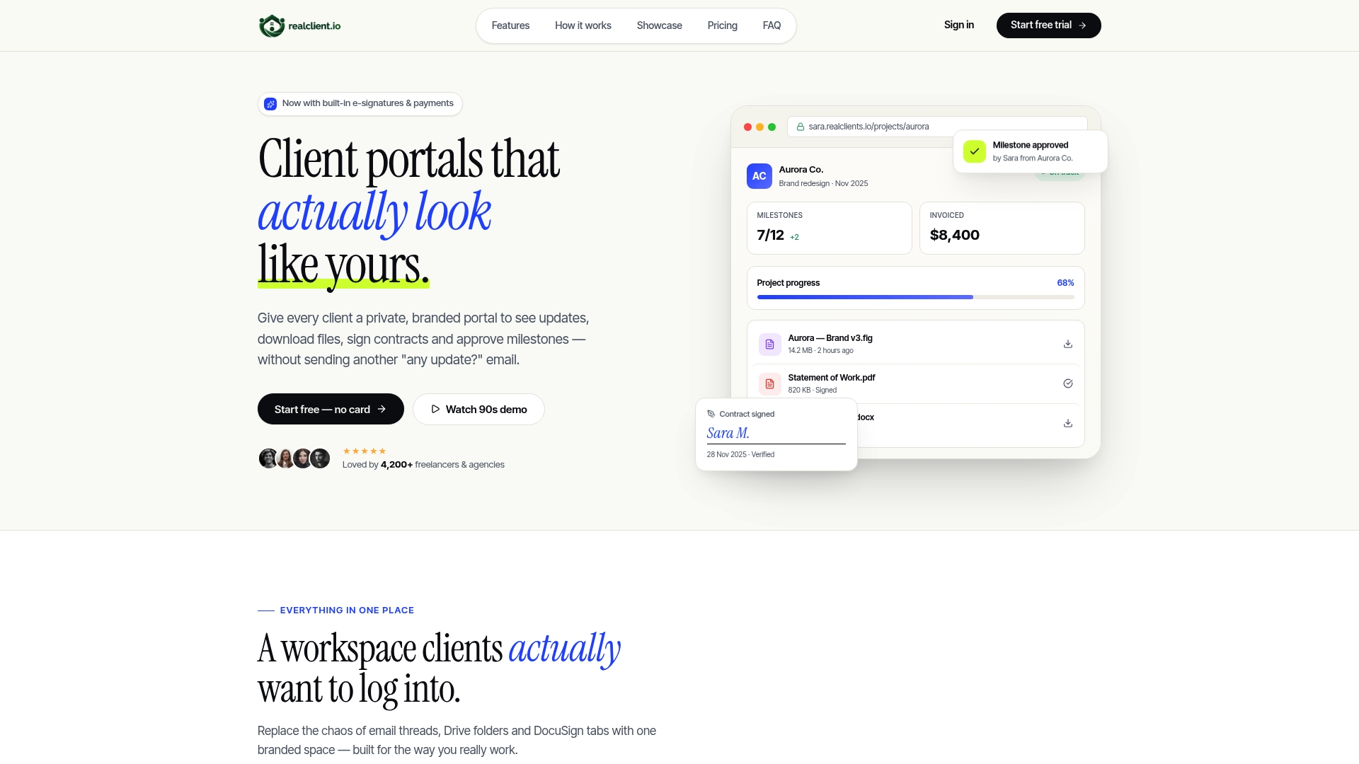
Every plan includes custom domain branding, role-based permissions, and the security basics clients expect by default. The onboarding checklist and adoption tracking covered earlier in this guide come built in, not bolted on after launch. If you've been sketching a custom build in your head, compare that timeline against setting up a working portal this afternoon. Check pricing and plans and start a trial to see your first client workspace live before the end of the week.
Sources
For deeper technical detail, the complete portal design guide covers information architecture at length. Developers building custom should study the FastAPI-based client portal demo for authentication and dashboard patterns worth forking.
- Website Portal Design: The Complete Guide to Building Portals
- How to Build a Custom Client Portal (2026 Guide)
- Customer Portal Design: Features, Examples, UX Patterns
- 12 Client Portal Examples: Real Designs & Features 2026